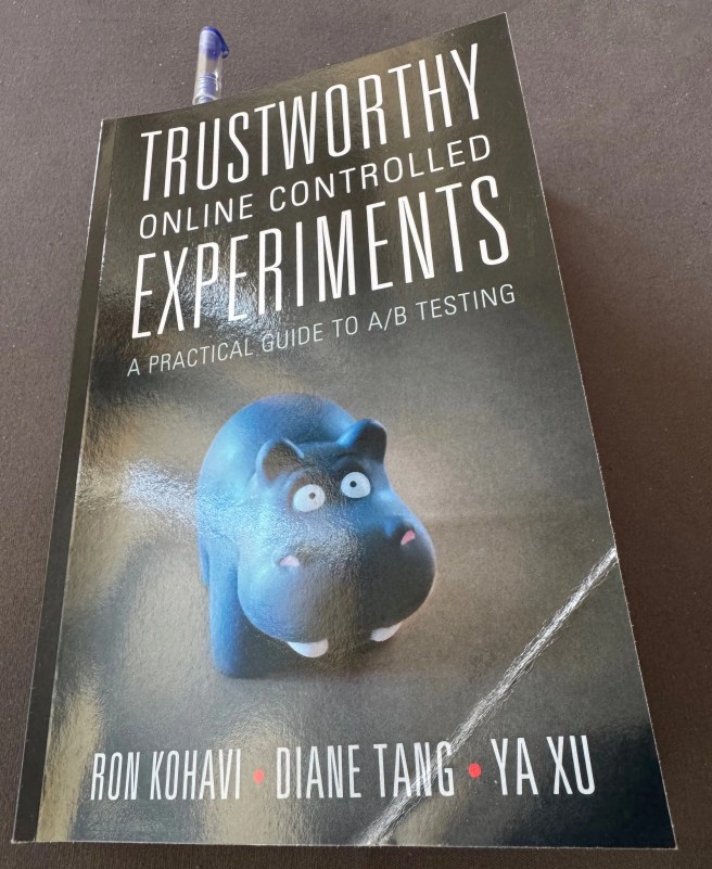
This book is a rare jewel that I would recommend to anyone, running A/B tests. Pretty happy with the purchase and my time spent with it.
After I figured out that something with my understanding of how experiments should run was off, my instinct was that it’s math and stats skills that were lacking. So I looked into improvements in the area of probability and statistics first and my last two self-improvement books where in that area. Trustworthy Online Controlled Experiments isn’t about math. It contains condensed experience from people, wrangling experiments at Google, Microsoft, and LinkedIn, and then has some advanced chapters, intended to make the book complete.
The area that stuck with me the most was how to pick metrics for evaluating experiments and what to do with them.
For example, one of my most beloved revenue metrics (average revenue per user) is considered a health metric by the authors and their reasoning very solid. They argue any primary metric should be around user journey, usability, and satisfaction, around the purpose for the specific service. Revenue is an indicator how well the overall system performs but better indicators exist that are also easier to move with an experiment.
Many other metrics I currently frequently check, the book categorizes under drill-downs of existing metrics. The book also highlights the importance of having classical log data, like server errors, in the experiment dashboard. The authors list 20-ish industry standard metric ideas but also state that their internal systems have 1000s of metrics. What could these be? This statement also makes me wonder, how do they even make any calls, if they have so much data? Sounds like a good problem to have.
Regarding the number of metrics, the next book on the subject I picked, called Experimentation for Engineers, has a lengthy chapter about optimizing for just one metric. Then another lengthy chapter about optimizing for two metrics. Is that just a matter of taste? Being spoiled by the ideas of Trustworthy Online Controlled Experiments, I didn’t like it.
Imagine a page with two buttons, and we make one of the buttons orange in the treatment variation. Two clear metrics here can be clicks on the modified button and clicks on the non-modified button, together with the general metrics, available for all experiments. If the orange button gets more clicks, the other one will get fewer clicks. Such is life and decisions should be informed based on both changes. It’s also possible that the total number of clicks goes down because people perceive the page as spammy due to the orange color, despite orange clicks going up.
Optimizing for one thing without knowing the others can work but only in scenarios where there is really just one thing. For example, algorithmic trading of a specific stock. Optimizing for one metric while staying oblivious about the others and can produce errors and eventually erode the trust in experimentation.
So, thanks for reading this brain dump. It’s not about a cat, it’s not a quite a book review either because it covers just one area the book touches, but what can I do. The things that fascinate me are sometimes unusual.


When someone has 1000’s of metrics, I’m betting they are using some kind of principal components analysis (PCA) or some other multivariate statistics to help transform their data into two or three dimensions of greatest variability. Depending on their modeling scheme they could slice the data cloud by whatever component they wanted (e.g., PCA 1 vs PCA 203), with limited functionality at lower eigenvalues of variability. In my experience, the value is more limited past the third principal component, but I am an amateur or I may not understand PCA as well as I think I do.
Plus, it has been a few years since I last used multivariate statistics.
Glad to hear that has paid dividends on your purchase.
LikeLiked by 1 person
Could you recommend a book on the subject?
I think they focus on 1 metric, like a true north start. For example, something measuring engagement for LinkedIn. They just watch the other metrics for diagnostics. For example, average API response time goes up => experiment introduces a bug.
LikeLiked by 2 people
Most of my “education” on PCA was using paid macros, online reading, a ton of brain sweat and writing my own code in R (with very little Python coding). There are books out there, but I’m not sure which are best. Most of the written material out there is beyond my calculus skill sets and involves linear algebra. I just got good at interpreting and processing the data based on my criminal forensics experience.
The interpretation of PCA is “fuzzy”, by design — it measures magnitudes and clusters of variability, effectively squishing N dimensions into 2 or (sometimes) 3.
I’ll look around and see what seems to speak plainly without going into details on linear algebra and calculations and get back to you.
As I said, my resources are about a decade old or older. No one was writing much about it at the time.
LikeLiked by 1 person
Try this free article; it comes recommended. It gets into some of the conceptual ideas without throwing you into the deep end of the pool:
https://pmc.ncbi.nlm.nih.gov/articles/PMC4792409/
LikeLiked by 1 person
Gosh, it will take me some time to understand this. It’s new to me and the math is not intuitive for me. Thank you!
LikeLiked by 1 person
Yeah, scroll to the example near the end.
I don’t know that the math is important because you’ll NEED software to actually do the math or it will take days to do what software can do in minutes.
The conceptual, “what it does”, is the valuable part. It’s fun once you understand the power and how to interpret the results.
LikeLiked by 2 people
I’ve been thinking about simply hiding the metrics that are flat but that won’t work because if you have 1000 metrics, you can expect 50-ish to be significantly different even with zero changes.
LikeLiked by 2 people
The hard part is deciding if those significantly different metrics are knobs that can be tweaked, are fixed metrics, or if their significance is related to an unimportant variable.
I’ve found that with even as many as fifty variables, most of the variability can be modified with less than five knobs, often as little as one or two. The rest is noise unless you want to understand how they relate to each other and the rest of your system.
But my experience is largely with environmental data or environmental forensics applications. Your systems might be either more rigid or more flexible than those I’ve worked with.
LikeLiked by 2 people
The system is such that despite being very advanced, it can be improved significantly before it can compare to the systems Google and Microsoft describe 🙂
LikeLiked by 2 people
The buttons, etc used to be orange. Then, they were changed to blue, and users were told it was an “accessibility ” issue. Now they are back to orange
Changes like that erode general trust and users leave…
LikeLiked by 2 people
That example that I used is not something that really happens all that often or at all. Changing colors is hard because you need to think about accessibility (visual impairment, color blindness and so on), dark modes, mobile screen sizes, etc. There’s a reason why all major UIs look the same. It is much easier making a readable and usable UI, using mostly greyscale and a few shades of blue, sans any oranges.
The example came to mind because that was one of the first thing I saw being attempted in a controlled experiment 15-ish years ago.
LikeLiked by 2 people